This is a simple product, but in implementing the UX magic, I had to do some research and solve finicky browser-specific problems.
The origins
I first needed social media images upon launching The Code of Conduct Generator a while ago. I resized them in Photoshop. One by one.
In my later projects I tried using online tools, but I still needed to, again, crop images one by one. The tools provided presets for common social media, but I needed to manually adjust the crop for every one of them.
I really wanted to solve this problem, but by that time I wasn’t familiar with what modern products had to offer. Instead, I was instantly thinking of OpenCV, object recognition and other hard machine learning stuff. Of course, as I had zero experience with such problems, just the idea of learning something like OpenCV just to crop images made me instantly put the whole thing into the “later” bin.
Fast forward three years and Uploadcare comes to me with the exact same idea. But this time, their Intelligence API is there to tackle the hardest part of the equation — actually cropping images.
I just needed to integrate their API, which is really nothing more complicated than installing an NPM library. I instantly agreed.
The art of creating problems
In designing products, there are usually two completely opposite extremes: the explanatory design and encapsulating design.
The explanatory design philosophy states that a thing should provide the whole picture of how it functions upon you just looking at it, so you need no instructions to operate it — you already know how it operates and what you can do with it.
The encapsulating design is an opposite, trying to encapsulate the implementation and essentially give you the magic button that does the thing you need.
I think of coffee makers as the perfect analogy, so I made this infographic:
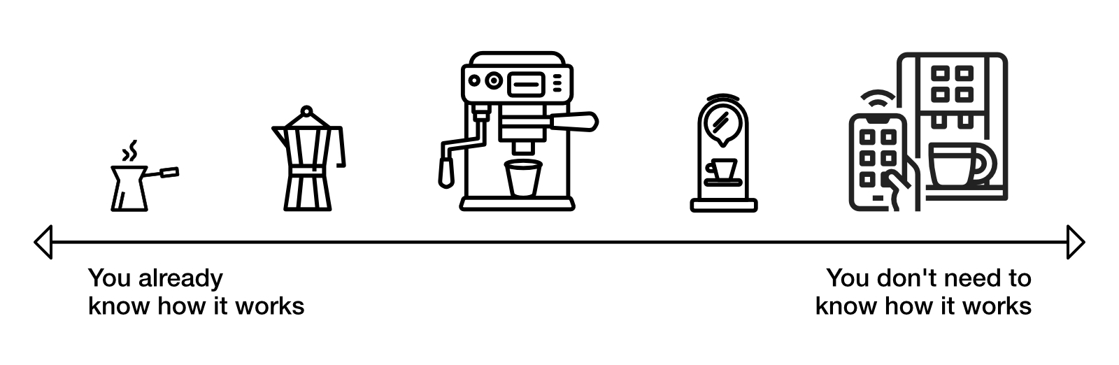
Cameras, kitchen and home appliances, cars — basically everything that was ever designed is somewhere on this spectrum.
Unix tools was heavily inspired by the former. Iconic Apple products was surely designed with the latter in mind.
Going to the Apple Store for the first time as a kid who learned Pascal was a career-defining experience for me. I still find ad-hocs beautiful, in fact here’s a whole article about them, but being mesmerized by how Apple products looked and worked back in 2009, I still use the memories as a reference. 12 years later, I still stand by this very idea — the magic button with the least background required to operate. In fact, both image-butter and fast-image-zoom made with that very principle in mind.
So, what functionality do we need? You just upload an image, the API crops it, and you display the results. That’s basically it. I could do it in about three hours, just like with The Code of Conduct Generator.
But here’s a thing.
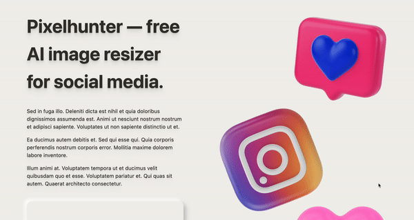
Pixelhunter was going to be The Big Party of a product. The product that is essentially a celebration of its own existence, it’s needed to be perfect.
Keeping in mind that Uploadcare essentially crops pictures pressing their own AI magic button, I rolled with encapsulating design, designing the magic button of my own. Unsurprisingly, instead of just three hours, it took forty.
The result
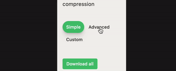
Configuration
I wanted the whole thing to be maintainable without a need for a programmer. So I created the simplest DSL possible (really just a config file syntax) that would allow to extend the product without writing code, with the only limitation being that you need to stay inside the domain area.
Here’s how it goes:
[{
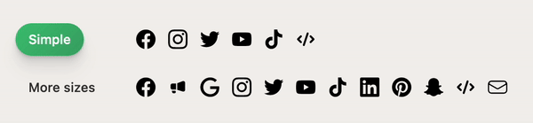
"app": "Facebook",
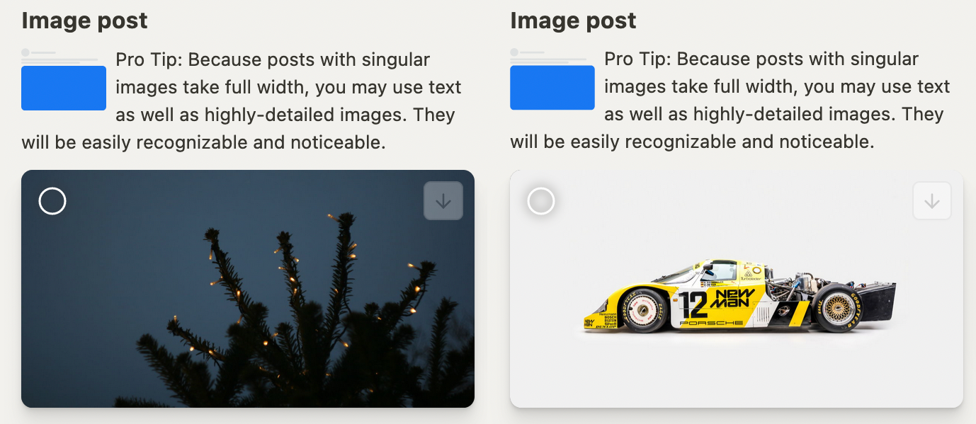
"description": "Because the size of this social network, Facebook images are mostly utilitarian. Don't expect people to passionately explore them and pin them to their moodboards. However, Facebook supports a wide variety of sizes, so you can utilize them to build a solid brand image.",
"logoSrc": "logos/facebook.svg",
"sizes": [{
"name": "Cover photo",
"width": 820,
"height": 312,
"simple": true,
"positionSrc": "positions/facebook-cover-photo.svg",
"description": "Pro Tip: Treat this like a billboard. Changing this picture regularly is usually a good decision. Experiment with images to see what your audience responds to best."
}]
}]
Everything in this product obeys the config. The grid, the sizes, the logos, the texts, even the sizes counter in the hero block and its pluralization — everything is recalculated when this config file is changed.
Just using the browser, one can edit this file right on GitHub, adding logo images there if necessary and clicking “commit”. Everything else is done automatically.
Colors
The background is #f2f1ed — white, but not too white. Why? Social media images often have solid color backgrounds, and often it’s a white one. Dynamically adjusting the product background to act in contrast with the color of the image would be overengineering. Why not just roll with a white-ish background, so both dark and bright images look good on it? The additional warmness of not just the gray really adds to it.
The main text and border color is #37352f — again, black but not quite.
I’d like to put emphasis on this color choice. By simply changing colors I omitted the whole mess of recognizing main colors and setting them with JavaScript. Just changing colors is robust, minimal and flexible enough to do the job. It just can’t break.
I keep doing this because of the Jira paradox. See, when every task is marked “important”, none of them are. It’s like writing everything in caps. I keep true black and true white unoccupied, saving them for the time when I need extra emphasis. When the most black color you have, the #000 is already occupied, you lose that ability, ceasing to make a color blacker than what you already use for each and every text element of your website.
Our brain seem to perceive “dark gray on bright gray” as “black on white” to simplify things, but still see the respective true colors when you add just a touch of them to draw extra attention.
Tabs
Just transitioning between active and non-active states was easy enough to do by just changing background-color from whatever the active color is to transparent. Sure, this is the technique everybody uses.
But I wanted to go further.
I wanted the tab background to act as its own entity, sliding around geometrically.
To make this work, you’ll need a separate background element dynamically measuring the width of the target tab it’s currently transitioning to and its position to make the transition smooth. Thanks to CSS, it just goes for the shortest path.
Challenges arise when we come to making this responsive. As background element only connected with its corresponding button with JavaScript, it’s unaware of the context change unless we do it.
We need to dynamically recalculate the background element position on the resize event. However, resize events can fire really often when you resize the browser window. So, we need debounce. But, there is one case when a singular resize event is dispatched — it’s when a user rotate their mobile device. So, we don’t need just any debounce — we need the tailing mode one.
A tailing mode debounce executes the first call instantly and then goes into debouncing. So when a user rotate their device, tab will be instantly called up to start recalculating its position.
Screenreader
I often hear about accessibility “preventing” UX and frontend developers to do their job properly. As a matter of fact, yes, WCAG colors and placing labels above form fields may confuse less skilled and the most stubborn designers.
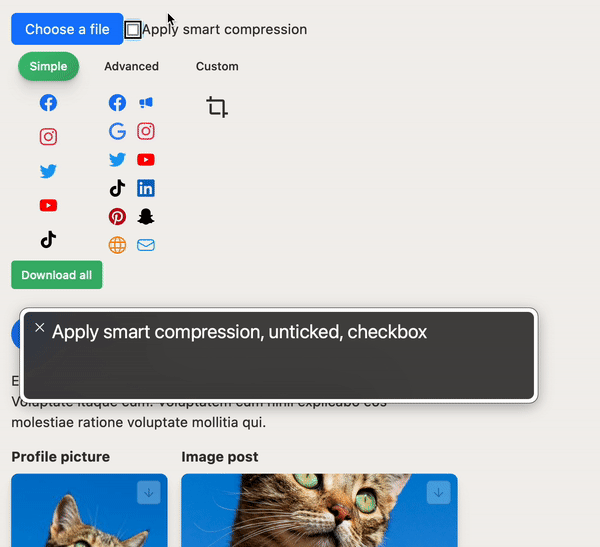
But accessibility is not just that. There is no excuse for not filling in alt attributes on meaningful images and not putting aria-hidden="true" on purely decorative elements.
When done properly, ARIA makes a solid screenreader experience. Look, VoiceOver reading the meaning of completely custom, complicated control elements that took five paragraphs to describe!
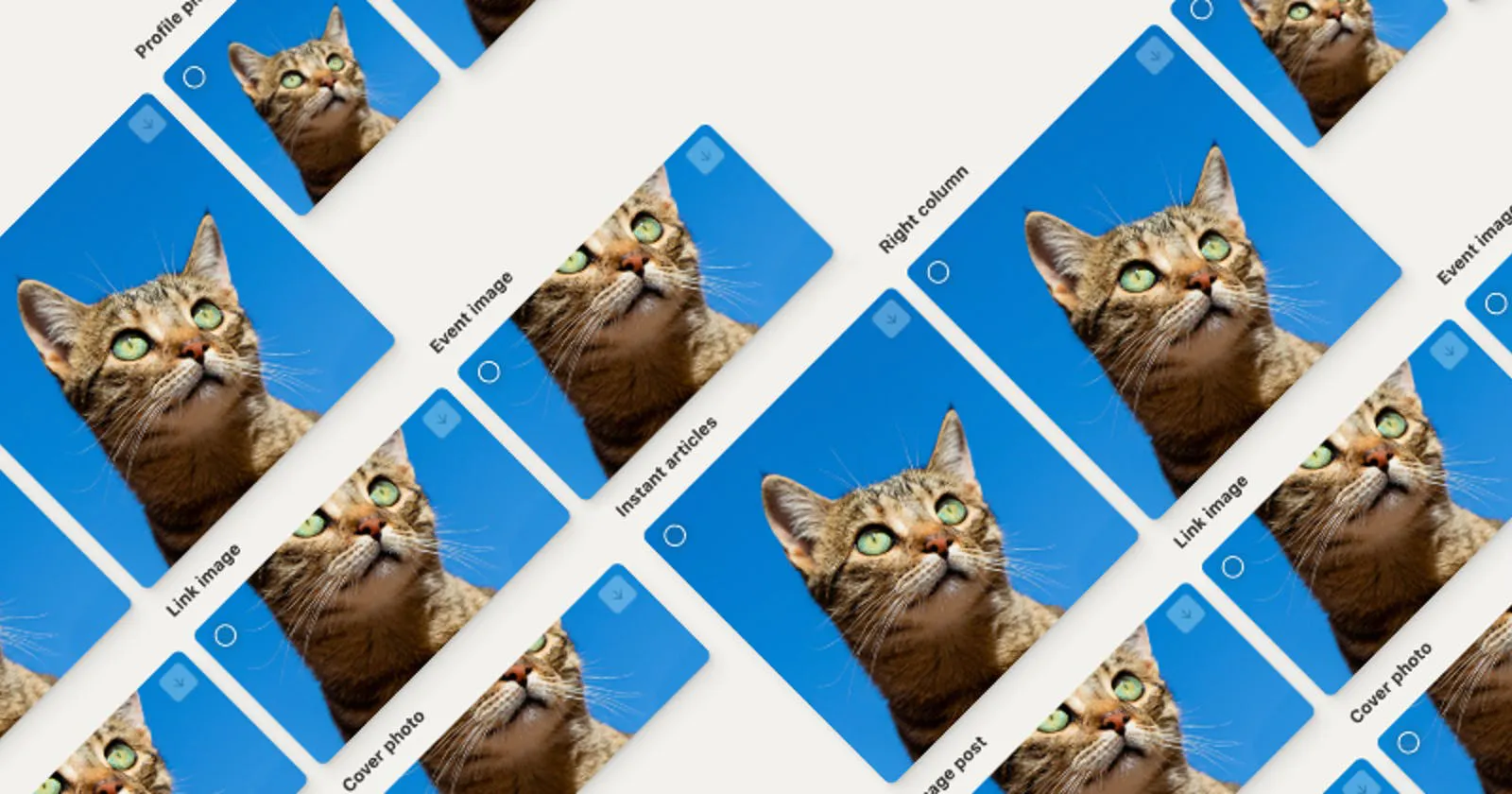
Grid
This product is all about pictures. There are really huge ones. There are long ones and wide ones. So I came up with the idea of occupying the whole width available and decided to choose the widest container I use — the 80rem one.
To display the images beautifully, I use the flexbox grid that wraps while JavaScript is sorting images in a smart way:
(a, b) => {
   const byRatio = (a.width / a.height) - (b.width / b.height)
   if (byRatio !== 0) return byRatio
   return b.height - a.height
}
Pictures are sorted by their aspect ratio. As larger pictures shrink because of their fundamental responsiveness with max-width: 100% and height: auto, this technique yields better result than just sorting them by their height or area.
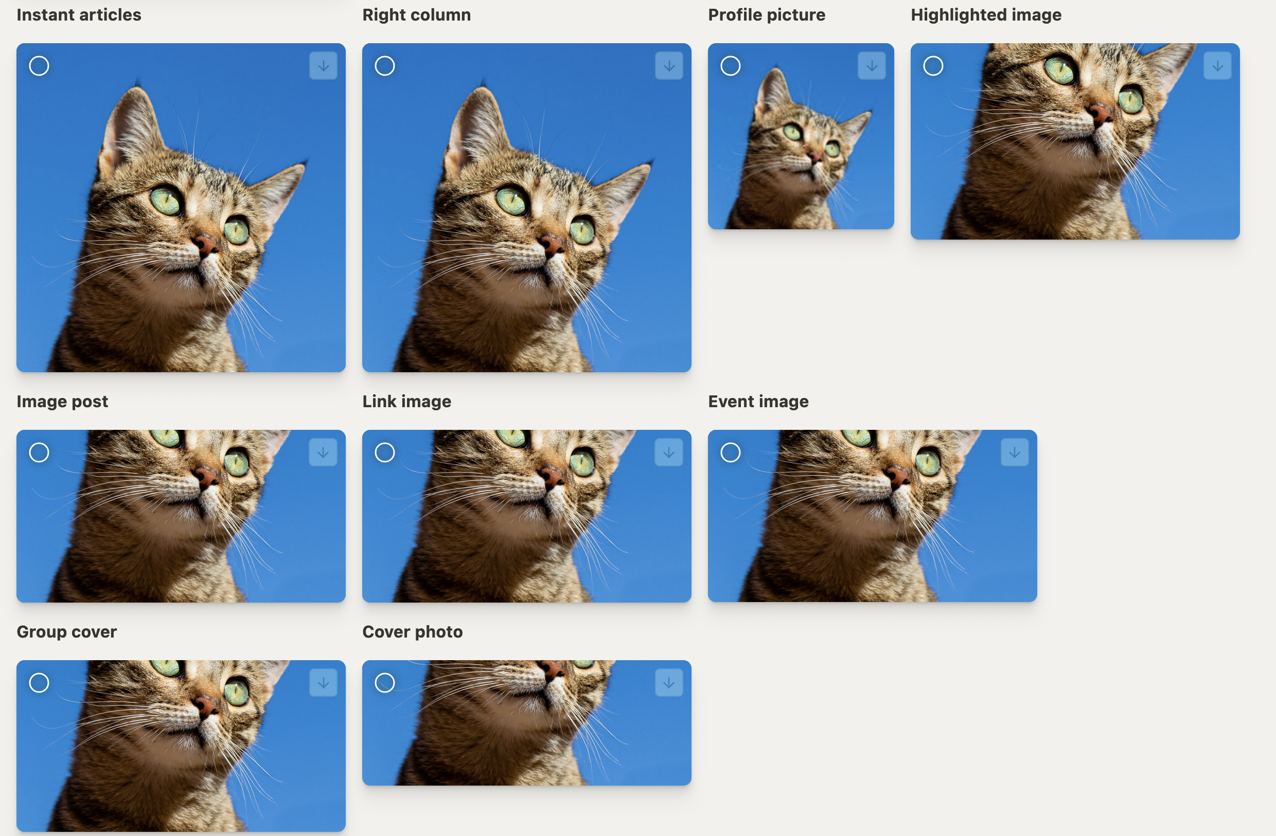
Using just intrinsic grids and flexbox, I was able to achieve full responsiveness with no media queries. Yep, you read that correctly.
As a matter of fact, I use the only one media query in only one place, just to reposition this while keeping logos aligned. This block is entirely optional.
You surely can make 100% responsive beautiful UI without any width media queries at all. It’s also faster and more responsive without them. Here’s an amazing video by Heydon Pickering about such techniques.
Animations and perceived performance
Initially I wanted the interactive 3D hero images like that:
I did it, and then I noticed something — my computer was getting really hot, and the website was laggy. It’s a top of the line Apple M1, so even if this kind of computer is struggling, what would other user experience?
I decided to drop the tilt, and just static animations was working butter smooth. I’d trade an insignificant UX quirk for a huge performance boost all day, any day.
Also, I designed a nice appear animation for the grid back when the hero block wasn’t there. But later, as the hero block grew taller than a common screen height, I decided to turn the appear animation off because you really have to scroll your mouse wheel violently when the page loads in order to see it, and it’s also happen in the most intensive part of a webpage display lifecycle — upon first load, when everything you have is trying to load simultaneously.
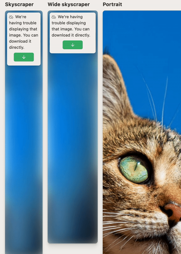
Fallbacks
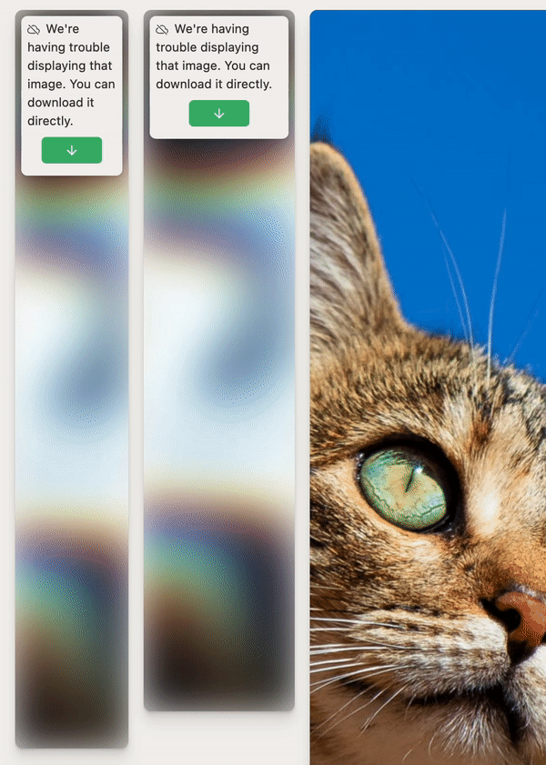
Blah blah blah, things break, blah blah. In case of Pixelhunter, things started to break in development. You see, I use the ad blocker. And Pixelhunter supports common ad sizes. So my ad blocker was just, you know, blocking some images even in app served from my devserver.
Many people use ad blockers. Other than that, things really do break. What if API doesn’t respond for some reason? What if an image is just not displayed because of a random connectivity problem?
The fallback is surely needed. I’ve chosen this gorgeous, lush GIF by Erica Anderson:
The problem is, despite being stated, width and height of an image doesn’t really do anything when the image itself is display: none. As we are guaranteed to know the sizes needed (because we, you know, crop images to fit them) we can always resize the fallback to whatever dimensions we like.
Here’s a catch, though: if we just apply width and height in pixels with CSS to a div, it will prevent that element from shrinking, breaking the grid.
So I used the ancient aspect-ratio trick:
.ytVideo {
   margin-bottom: 56.25%;
}
Look, a responsive 16 / 9 div!
Using that technique and always knowing the sizes, I can calculate the percentage dynamically:
paddingBottom: `${(props.height / props.width) * 100}%`
As we don’t use height: 0, there will always be the room for the fallback download component:
When a pic won’t load, we try to load it’s 10 by 10 pixels version, stretch it while preserving its aspect ratio, this time with background-size: cover, blur it and add some opacity. I also blur the GIF, which results in a gorgeous fallback that I don’t want to hide. I’m not ashamed of displaying it in its full glory.
Every fallback dreams of being an easter egg.
I really want to mention other tricks like asymmetrical transitions that have different timings in and out, but then this article would be a book.
The dread
Making magic happen is hard. UX magic is particularly fragile, frustrating and finicky under the hood.
I wanted vanilla-tilt and react-medium-image-zoom to work together smoothly. I didn’t make all that obsessive research on Bézier timing functions and give that interview for nothing.
After tackling all that bugs with vanilla-tilt alone in Safari, initially just putting transform: translateZ(100px) everywhere but later establishing the system as I do with z-indices, I was facing the problem with RMIZ.
The latest published major version of RMIZ is v3. It didn’t quite provide the control I needed, so I went to its GitHub and found out about v4. I installed it, and after four hours of straight-up code atrocities just to make it work, I found out that Safari just won’t cooperate, and the animation was helplessly slow.
I nosedived into issues just to find out about v5. As major versions commonly do, it featured an entirely new API. There was no documentation. So I installed it manually specifying the version and just by reading the code I figured out how to use it.
It worked smoothly, but it wasn’t quite what I needed. To improve the UX in my particular case, I needed to adjust some of RMIZ code. So I went for it with patch-package.
After a whole new marathon of pure struggle of making it all work in Safari, I was helpless and decided to disable tilt in Safari altogether while keeping RMIZ. With Safari, you try it, it works, and then it suddenly doesn’t, and you don’t know why.
After all that I found out that patch-package somehow works in my environment but fails miserably on Netlify when patching RMIZ after successfully patching other packages. After another session of tampering with all this mess, I just downloaded RMIZ and put it there as is.
Now everything was working smoothly. I definitely would recommend you to try to integrate two complex, event-driven libs that both rely on 3D transitions together.
Summary
Pixelhunter is sure much more complex than it needs to be. But through struggle, fighting rapidly arising UX problems one by one, you can create a product that is nothing short of magical.
Of course, Bootstrap works, and it’s much more stable.
I just don’t want to use it.
Privacy
All the pictures you upload are deleted after 24 hours. The source code is available on GitHub.
Credits
This project was sponsored by Uploadcare and it utilizes their Intelligence API. However, Uploadcare retained no control over this article, the product design, UX, code and other major decisions. They just came to me with the idea.
- Idea — Igor Debatur
-
Design, UX, code, logo, texts — Miloslav Voloskov
- “Website” icon — Karacis Studios
- “Email” icon — Rainbow Designs
- Open Graph icon — Heroicons
- All other brand icons — Simple Icons
- Cat demo image — Cédric VT
- Lush gif — Erica Anderson
Strive for magic in every detail and when you finished it would make an impact.